The problem
While colourful communication with images of awards have their place, I wonder whether we need to walk back some of our email communications to just be black and white. Often the images don’t load on a computer, or crowd out the point you are trying to make on a phone, so what are the images for?
Client communication
I fear that we have forgotten that marketing and client communication are two different things. If the person already knows who you are, if they have already reached out to you, are you treating that communication as different to an initial marketing email? If the person already knows who you are, do they need images and pictures of your awards?
This week I asked an agent to send me a Contract, and I could not for the life of me figure out where it was on the email. There are multiple links, photos, photos that generate links, and awards displayed at the bottom of the email. I forwarded it to my work account to see if I had better luck opening it in Outlook, I did not. I had emailed back asking if it was attached as a link, because I have opened all of the links? They responded saying no it was just an attachment. It was of course also part of a string of emails now, and therefore grouped with other emails. I was waiting for my IT husband to get home to see if he could solve the debacle before I email the agent again because I didn’t want to bother the agent. While I was waiting I could not help but think, I wonder if my emails are ever unclear for my clients?
There is a place for colours and things that move, and there is a place for sharing sales focused information. When my husband got home (and yes he could find the attachment) he said to me, why does someone who you are already communicating with, one to one, need photos and marketing material to tell you who they are? Don't they already know who you are?
But everyone does it?
In my current in house role the rule for the organisation is that email signatures should be plain text, no hyperlinks, no images, just plain text. This is so that the person receiving the email can always read who we are, and where we are from. They know how to contact us (they have our email), they know who we are, and the email is being sent for a reason. I am communicating something. I think about this a lot, and have set my own personal emails to plain text as well because I think this policy is correct.
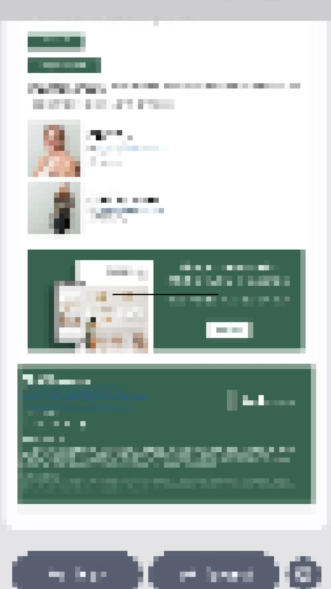
This is the email that I received that has a document attached to it. I know who this person is, I reached out to them. Why do I need multiple hyperlinks to their marketing, bio pictures of this woman and someone else in her office, and then more images inviting me to visit more of their marketing? I already know who they are.
I have pixelated the image because I am not criticising the individual, I see versions of this all of the time. If you scroll through your inbox right now you will see that almost every email looks like this. There is a place for emails like this, but I don’t think that place is one to one communication with a client or customer.
Now does the fact that my husband could find the attachment, but not me, point to me being the problem? Yes, I accept that. However, as an intelligent woman with money to spend on professional services don’t you want a client like me? Do you only want clients who can filter through all of this to find what they actually want in your email?

In this email signature, which was different from the first despite being from the same person, there were two different website links, three social media links, a “book now” image, an image to click on to get their in house publication, and then images of industry specific awards.
The presumption is that every person wants all of this, or that those who don’t want all of this can simply mentally block it out. Not everyone has the ability to filter this type of visual noise out, and parties dealing with solicitors may be the most likely people to be unable to filter out unnecessary information (after perhaps people dealing with medical professionals).
BLACK AND WHITE APPROACH
The funny thing is that as lawyers we often talk about a black and white approach to things, and often it is either portrayed negatively, or pejoratively. I think when it comes to email and our client communication, things like brochures and advises, there is a place for colour and pictures and diagrams, and there is a place for straight forward communication. What I observe with places that have these types of email signatures is that all of their communication is like this, they have a default position where everything needs to have this type of footer for every communication.
There must be some communication in your business that needs to occur in a black and white way, in a simple way, in a straight forward way. Are you trying to make a simple, straight forward point, but using a confusing style to do that?
I am not suggesting that everyone should have a black and white signature for all of their emails, while I have that for personal emails my marketing emails are currently quite coloured and visual. I am asking if you should have two options. One signature with all of the bells and whistles for someone who you feel still needs to know who you are, and another signature for a person who actually already knows who you are. The law is complicated, people and their emotions add another level of complication, why are we making our method of communication so busy?
PRIVATE GROUP
I have been running for three months a private, paid version of NSW Estate Lawyers with a small trial group. The group has it’s own private monthly training, where they pick the topic, as well as ongoing access to all of my regular one hour webinars. In the next month or two I am going to open it up to another 30 positions. Would you like to find out when that happens, and get the first change to take one of those positions?